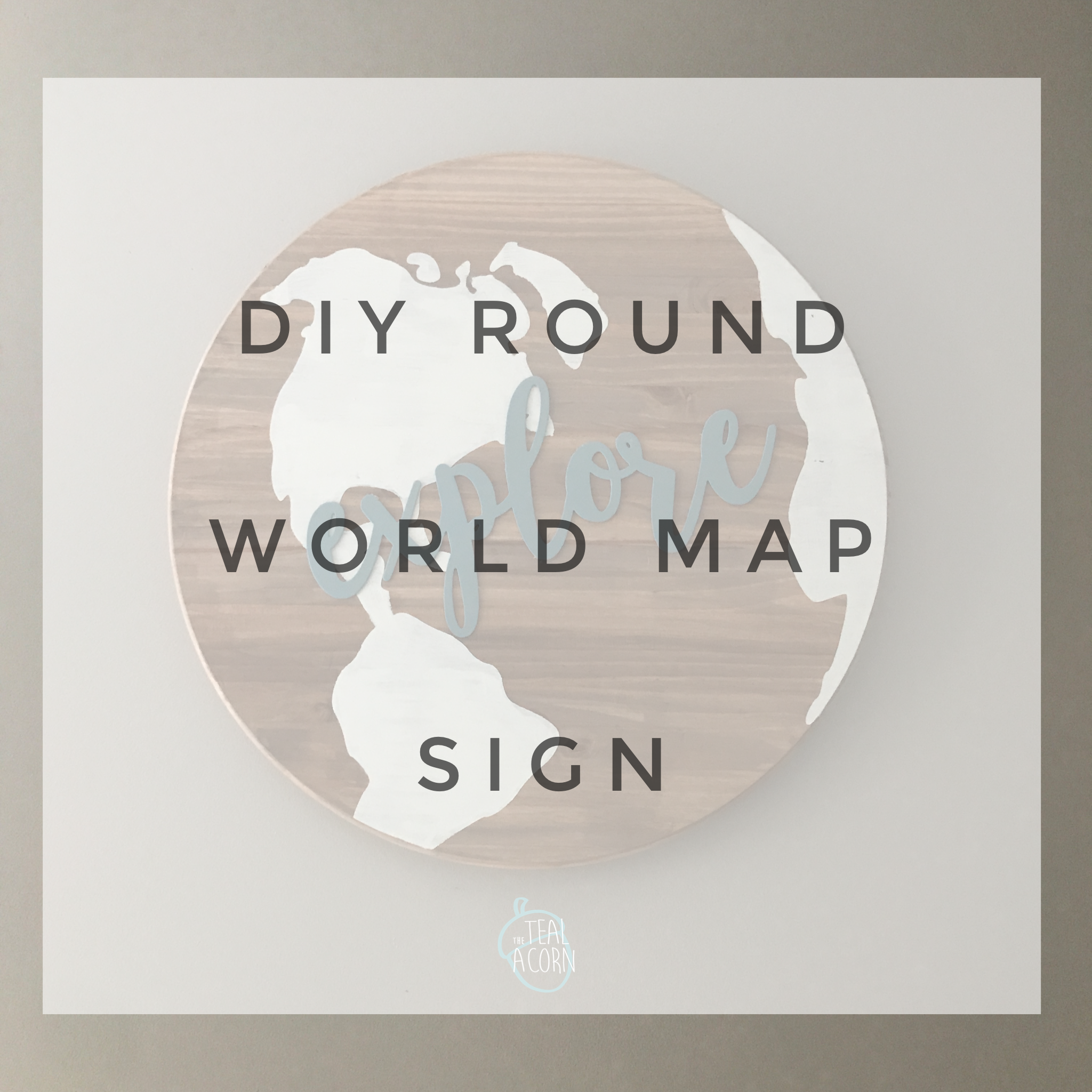
This round world map sign turned out to be a late addition to the list of nursery DIY projects.
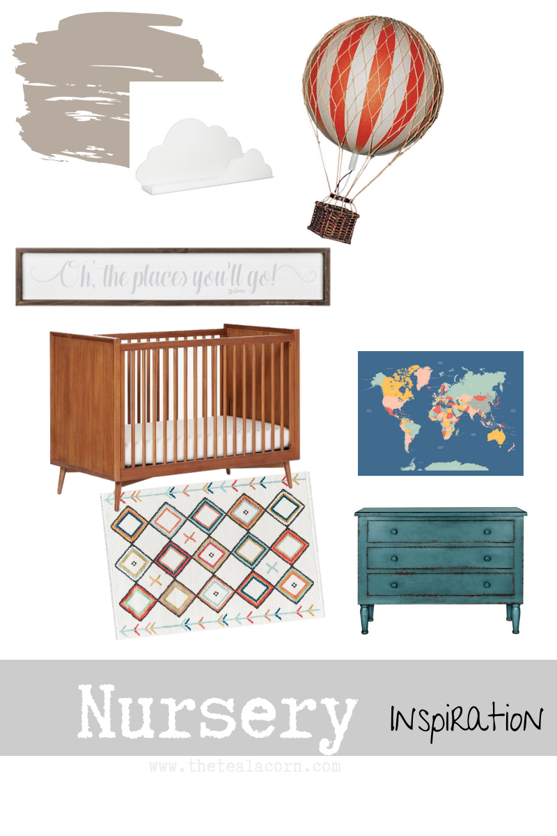
Initially, I wanted to order a map to hang above the changing table. The company actually makes mural wallpaper, but I asked for a quote for poster size. It was about $35. I wasn’t finding anything else quite as perfect- this had alllllll the colors I wanted that I thought would really tie the room together.

However, the closer it got to the time to actually pull the trigger and order the poster, I became hesitant. $35 wasn’t crazy outrageous considering that pretty much anything I purchased in that size would be in that price range. However, I didn’t love that I would need to figure out a way to frame it to keep it from looking like a poster on a wall.
My wheels started turning and I started googling. One thing I came across was a ROUND world map sign. I thought to myself, “self, you could make that”.
And now, here we are!

I started with a 24″ diameter table top round from Lowe’s. It cost me $19.
To stain it, I watered down a mix of some acrylic paints. I could have stained it, but the avoid the fumes and curing time, I opted for this method.

This color was equal parts of the nutmeg brown and truffle color with just a glob of the elephant grey. I added a touch of water (the cup above shows how much I started with) and I used a sponge brush to apply. Viola!

I found a free image on the ol’ Google and used it to create a stencil with my Cricut out of contact paper.

Once I applied the contact paper, I smoothed the edges with a layer of Mod Podge before I painted. This helped to seal up the stencil and prevent bleeding.

I decided to add the word “explore” to the sign. This cut out cardboard word was a Target dollar spot find that I had picked up a few months ago. I thought id add it somewhere in the nursery but didn’t know where. It started as a light sky blue which didn’t mesh with my color scheme.
I just painted it the color I wanted and applied it to the sign with some hot glue.

I’m in love with how it turned out! It is simple, but still fun. It meshes so well with everything else I have going on in the space as well.
I’ll be continuing to share my other projects for this space, so be sure to keep checking back!
You can check out my inspiration post here.
